Leading cookware company in the UK with over 50 stores nationwide. Project is a redesign project where I was tasked with creating a new identity that ties in with their offline stores and catalogue. As part of the project, I will be delivering a visual identity document where I advise on the types of photography they should be using, colour schemes typography and a load of other things. The agency was not providing development to the project so I would be working close with the in-house dev team at ProCook.
Phase 1 – Discovery
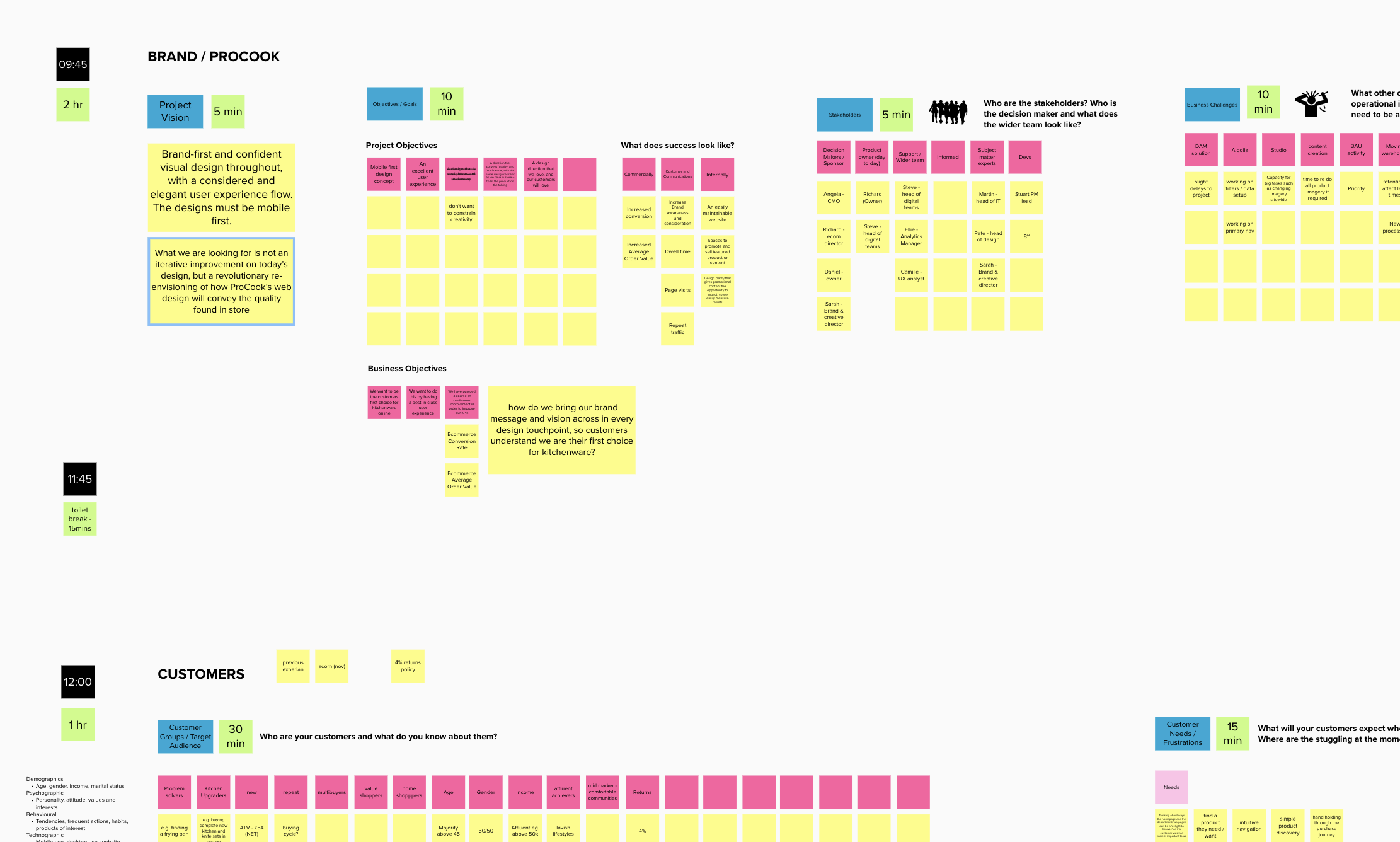
The team spent two days asking a lot of questions around the business, the brand and the look they were trying to achieve. Off the back of all our questioning and initial research, we were able to break everything down into a Mural board and create a design inventory where we outline what pages are needed to be designed and what will feature on there. We also have a list of sites that I can now investigate further and provide competitive analysis to help us drive change.
Phase 2 – Design ideas
Something I like to spend time doing is looking at the existing site and coming up with concept ideas before we’ve really spoken to the client to see what I can come up with, especially when we have a brief as open and free to do something different. Some of the concept ideas I put together over a weekend are below.
Phase 3 – Competitive benchmarking & analysis
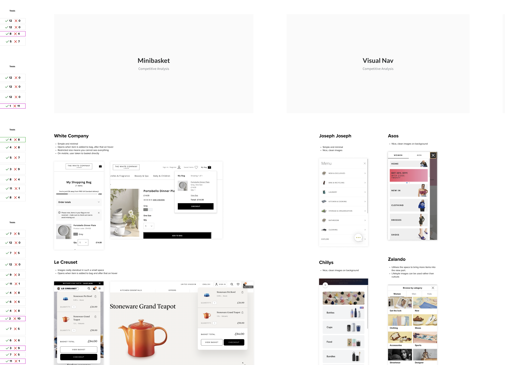
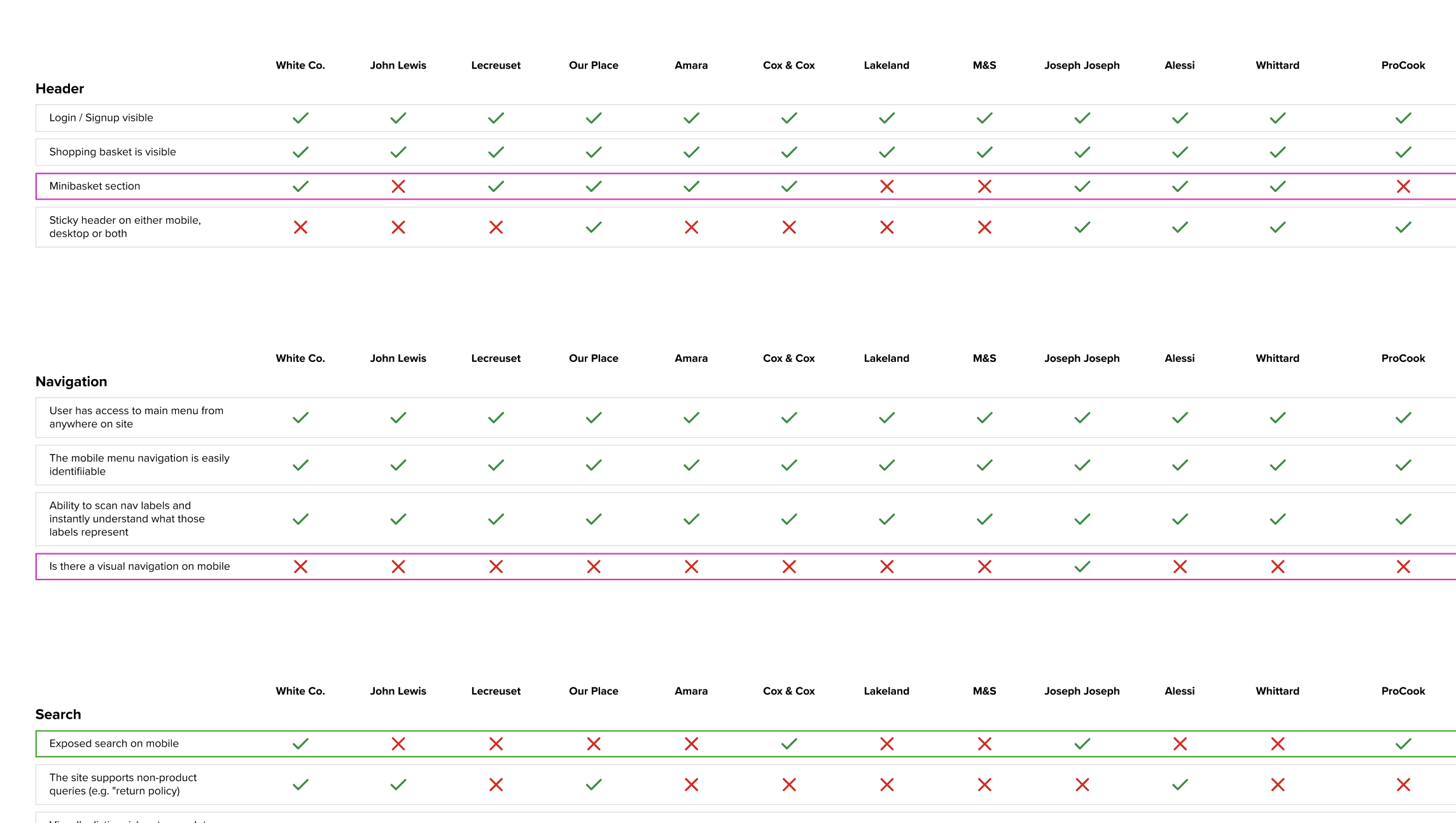
Taking the list of competitors and sites provided by the client and sites I have found in my own initial research, I began to break down each site and compare functionality and features to see where ProCook could take example from or lead the way. We look at things like do they have a minibasket, do they have cross sells in the basket and other functionality that might improve conversion and the user experience. Once I tested the sites and collected the information, we display it in a table where we outline who is doing what and how well. I also provided examples of where other sites were doing things well or not so well so we can take some inspiration and get ideas in motion.
Phase 4 – Wireframing
Once I had gathered my competitive analysis and fedback to the client, we agreed that I would now do wireframes for important journeys where we felt as a team we could improve the site and user experience. This was a chance to bring some new ideas to the table especially around the product listing and detail pages and look to try something different.
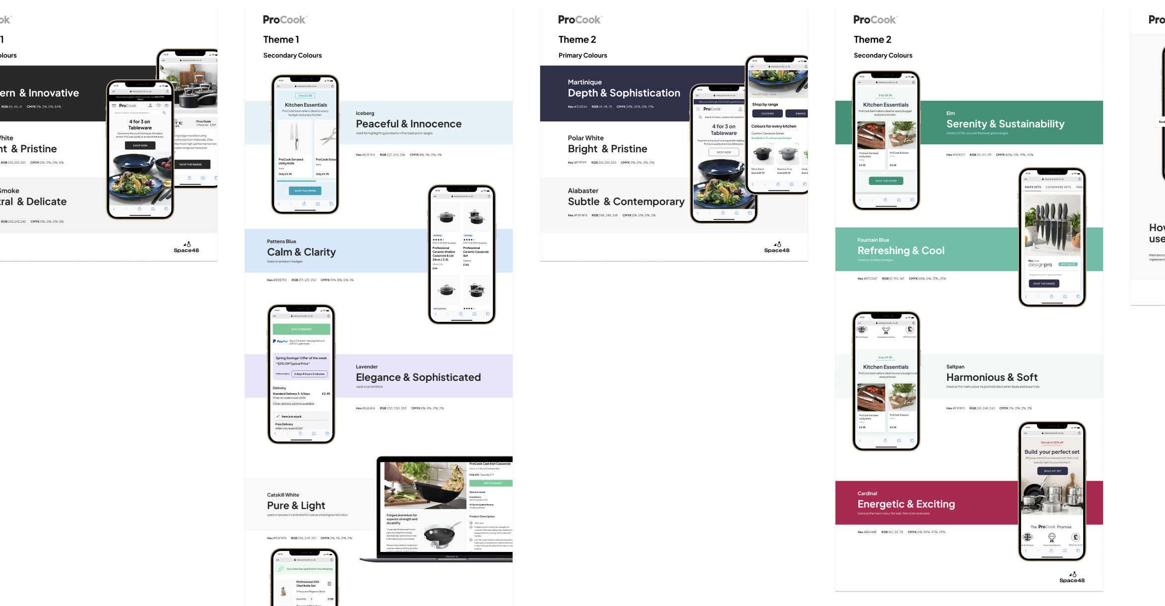
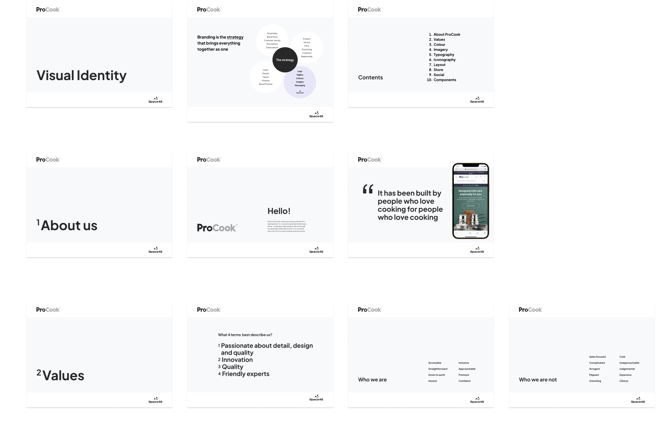
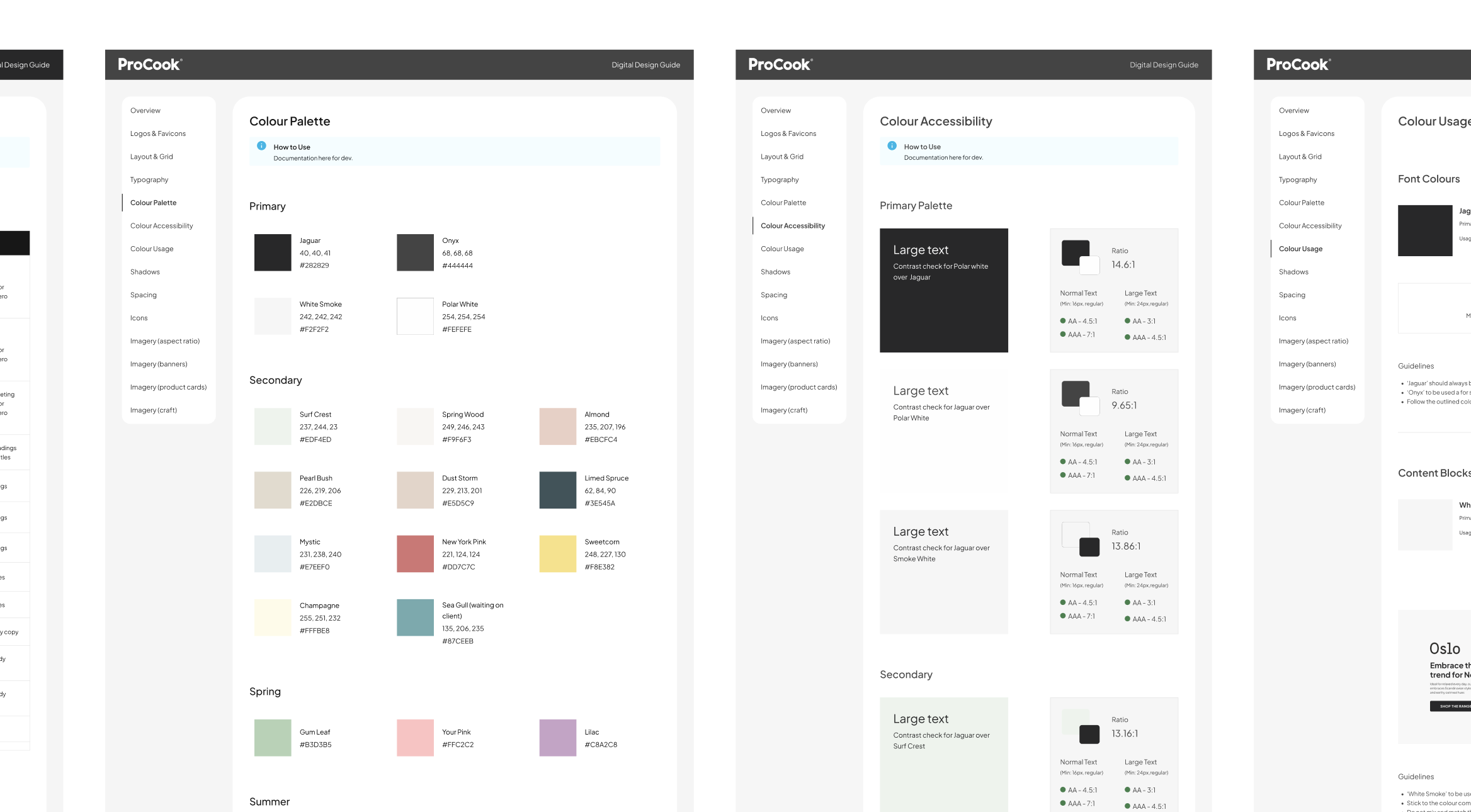
Phase 5 – Visual identity
As part of the brief, I was assigned the task of creating a visual identity for ProCook. This was something I had never done before and it was something that I found interesting but also hard to deliver in the time we originally estimated as there was so much to consider and so many ideas flying around.
The document was over 100 pages and broke down colour, typography, imagery, social, in store and hwo to use all that together online.
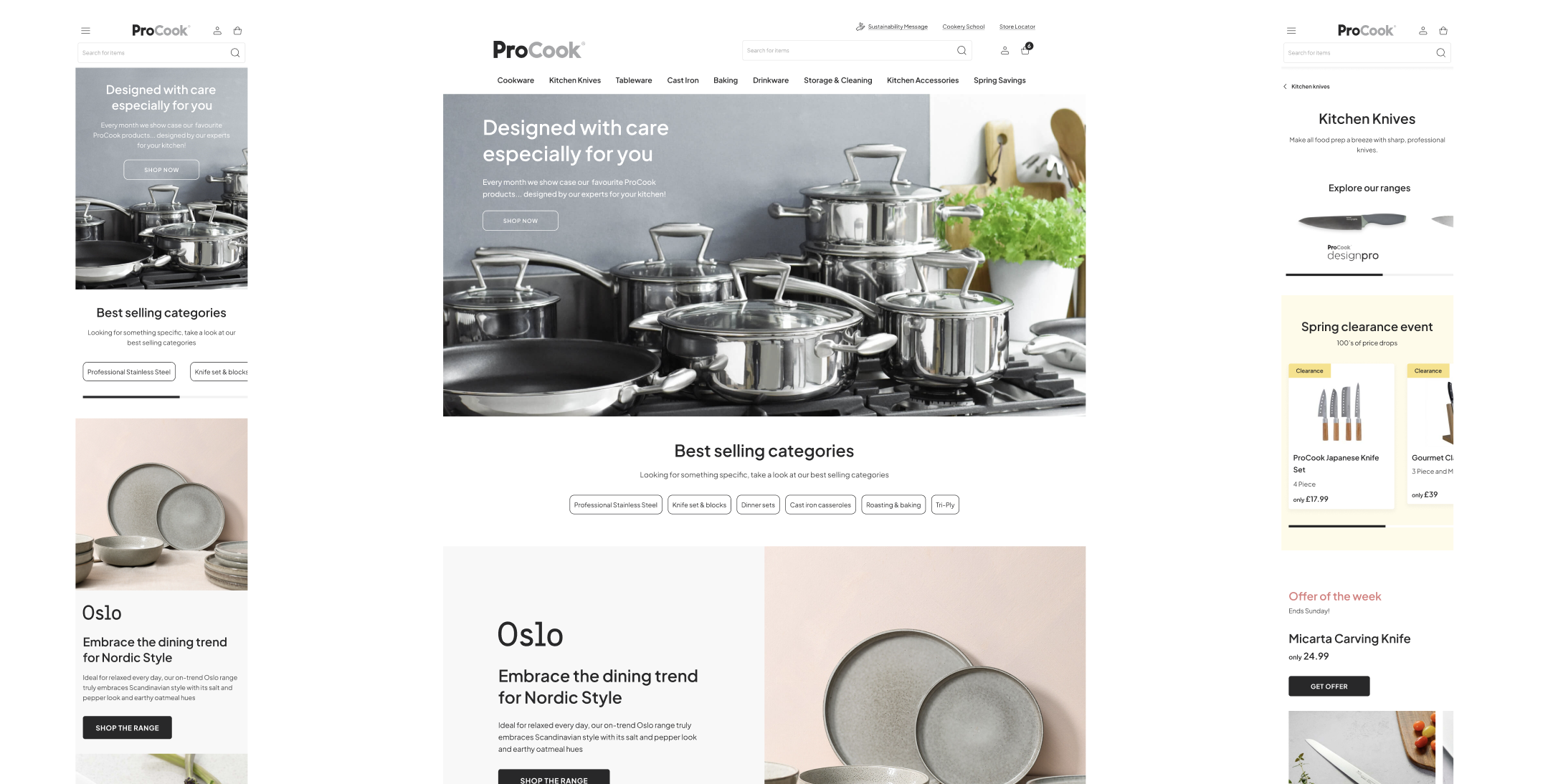
Phase 6 – Look & feel
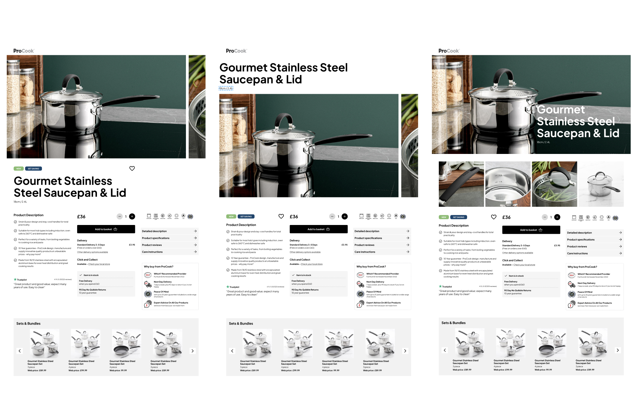
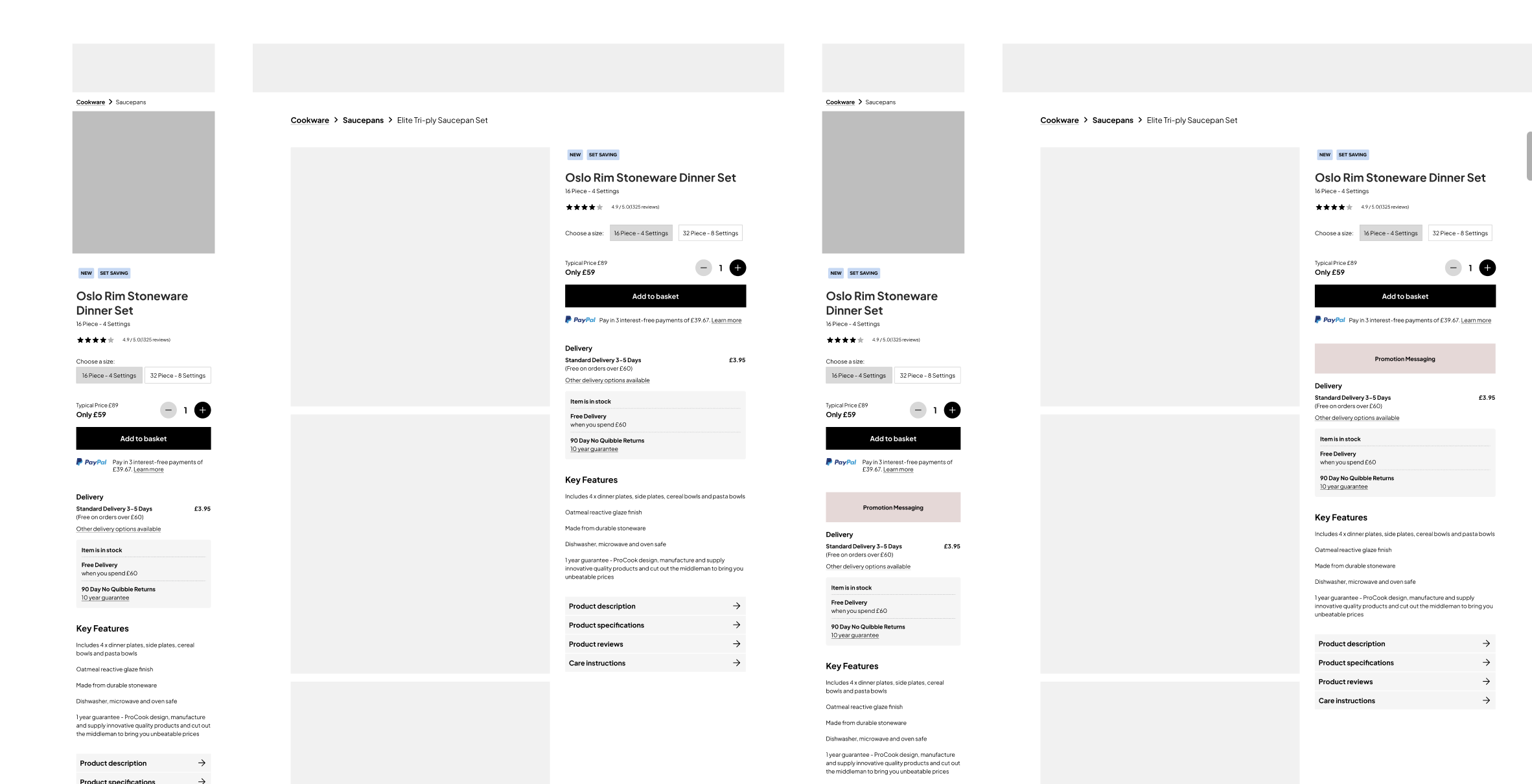
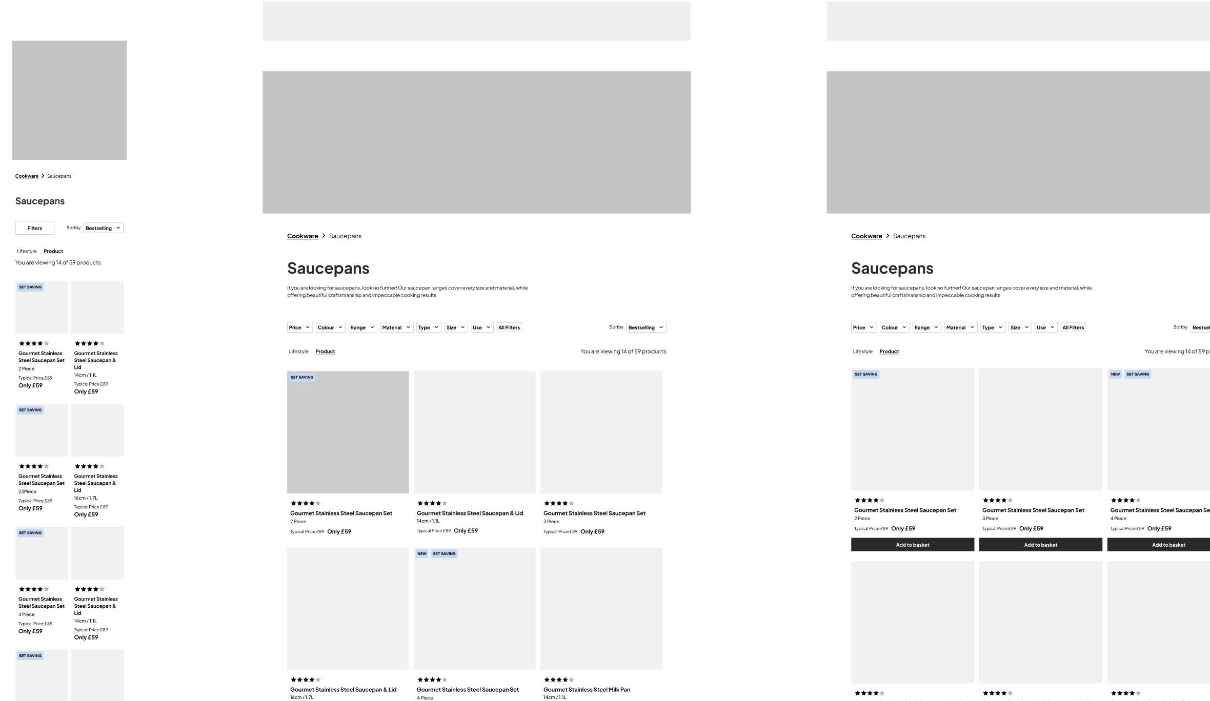
Once we had sign off on the overall direction of colours, type and imagery, I was tasked with creating some designs to show look and feel and how we saw the site being designed. For this, we agreed that I would show some homepage work, product listing and category landing page as they show a lot of the components we will need to design.
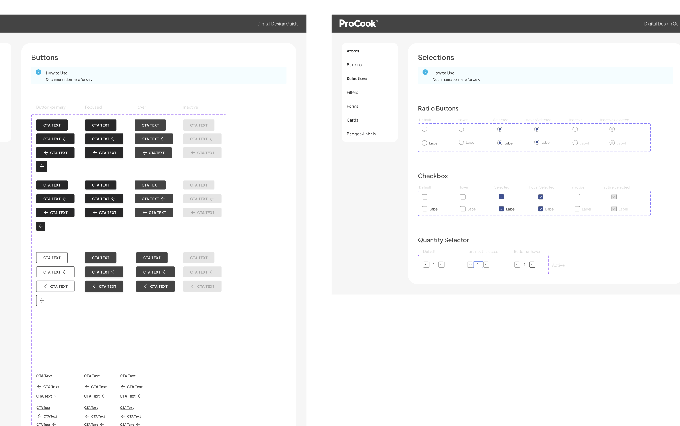
Phase 7 – Styleguide and components
We work closely with style guides and for this project we have a style guide in place to breakout the design for components and key design elements which feed into the designs. This is currently work in progress as it will be worked on during the whole duration of the project. There are 4 designers now taking the vision set and the design decisions made to deliver the site so I will be making overall design decisions and ensuring the site is consistent.
Phase 8 – Designs
Coming soon