I’ve been designing websites for 20 years and recently I have designed plenty of stuff for clubs and for my magazine, and honestly the same design rules apply for both. Good photos, clear text, decent colours and plenty of space. Get those right and you’re halfway there.
Images
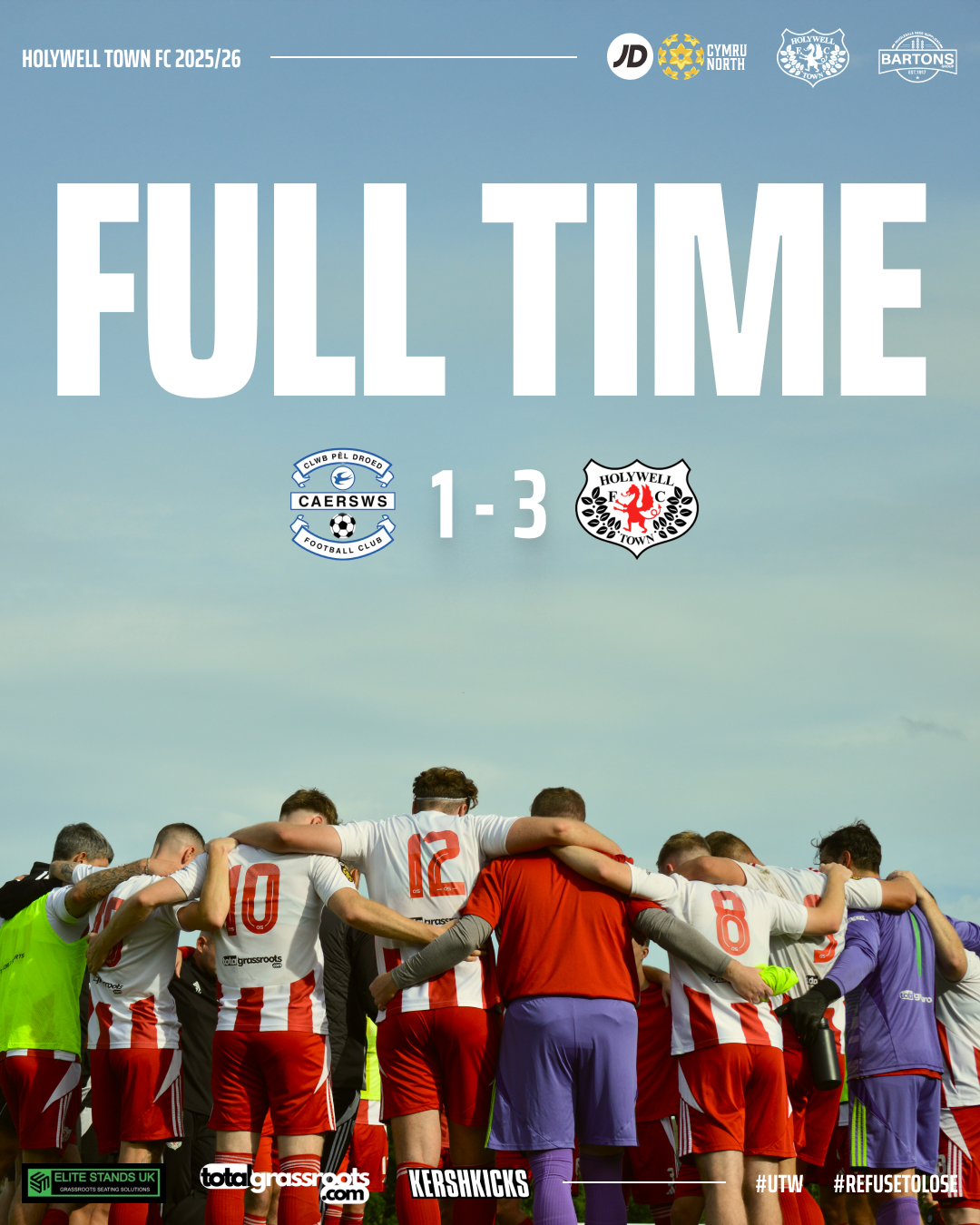
Football photos are always full of colour and movement, but the best ones for graphics are usually the simple ones. Shots with grass, sky or something plain in the background are perfect because you can stick text or badges on them without it looking messy.

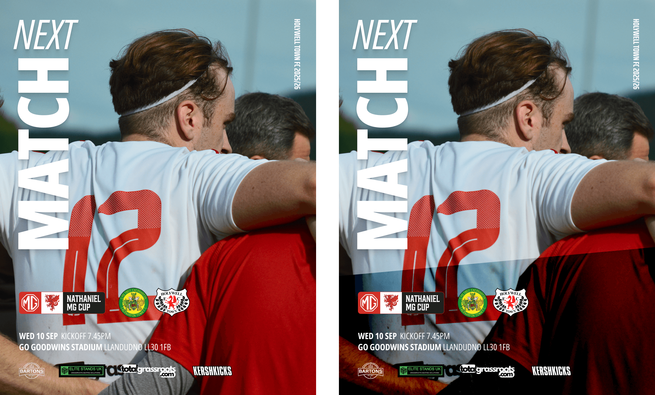
If you only have busy photos, do not just throw white text over the top. That is where loads of people go wrong. Add a block of colour behind the text or darken the image a bit so it stands out. Doesn’t need to be really dark, just needs enough to separate the text from the image Think about the people looking at it too, not everyone has perfect eyesight. Accessibility matters, and contrast is really important. Colour contrast is very important in the web world and graphics are no different. Consider the colours you use and if the foreground colour can be read easily on top of the background. White is not always the best option.

AI has helped a lot here too. If a photo is cropped tight, I often extend the background with AI so I have clean space for text. Little thing, big difference.
Keep it simple
Less is nearly always better. I get that you might have sponsors or bits you need to squeeze in, but if you can keep things clean, do it. I use 1080 by 1350 as my standard size which is the Instagram post size. It gives me enough space to play with and still works on other platforms.
Typography
Typefaces are a nightmare because you pick one and then hate it two weeks later. Best advice is to stick to one or two and make sure at least one has plenty of weights so you can mix it up. You do not need loads of different typefaces. Pick ones that go well together and do not be afraid to experiment. Some of my best finds have been accidents. Personally, I like a chunky headline typeface but I am also partial to a serif now and again. If your club has brand typefaces, stick with them but keep it clean and easy to read.
Uppercase or lowercase
Uppercase looks bold and works well for titles, but do not overdo it. When everything is in caps it slows people down because all the letters are the same height. For longer text, lowercase is easier to scan.
Text alignment
Centred text can look neat, but if you have a lot of words it quickly becomes awkward to read. Left align is usually the safer bet when there is more copy.
White space
Do not be scared of empty space. It is not wasted, it makes everything easier to read and stops your design looking cluttered. White space gives balance, makes the important bits stand out and just makes the whole graphic look more professional.
In summary
I hope these help, nothing new really or groundbreaking but might help take your graphics to the next level. It’s really important to experiment and find what works but also consider the audience and the impact the images might have. Some may have issues reading them. If you can think of any other tips, give us a shout and I’ll add to the list.