A few months back, I was asked by .Net to take part in their design challenge. I was massively stoked to be asked but I decided that it wasn’t a good thing for me as I’d not really done much design at that time due to being solely just a front-end dev and I felt putting myself out there would end in failure and possibly ridicule.
I regretted it but I saved face.
Fast forward to a couple of months ago and the same invitation hit my inbox. At first I thought up a few excuses and decided to say no. However something got me thinking about designing, why I stopped and whether I still had it in me. Sure, I’ve done a few sites over the years but I’ve not done a lot since the Marathon days.
I decided to give it a go. Why not, it would be fun and I might enjoy the challenge. I massively enjoy designing and maybe it’s something for me to look at doing again if the passion and the eye is still there.
So challenge accepted. Design a National Park website.
Now I had a fair bit of time to do the work but I jumped straight into it. I found myself just churning out ideas but never really getting anywhere.. So I stopped, gave up and loaded up Football Manager. I wasn’t cut out for this.
Now it was around this time I had been going on a bit of a journey with pattern libraries / style guides as well as speaking to Andy Clarke about CSS grid so I decided to incorporate doing the challenge with the learning of such skills. Also, I wanted to try and prove to myself the worth of a pattern library based on some actual work. At the end of the process, I’d have a design to submit and a website to build and hopefully a better idea on a good workflow and whether my ideas were right.
but why?
Taking the .Net challenge to the side for a minute, I’ve wanted to look at pattern libraries for a while. I’m a big believer in them. I also believe in designing in the browser. I think the days of multiple PSDs / JPGs are dead ( I wrote this in 2015) and the majority of the work can be done in markup saving time and money as well as freeing up valuable design time to concentrate on the things that matter. Of course this way of thinking presents it’s own set of challenges but I believe in it.
Also, CSS Grid looks amazing, rocket science but amazing. I’ve regretted not keeping up to speed with CSS in the past so wanted to make sure I adopted the new way of working quickly. Plus, having seen the work of Andy’s, I was convinced this would lend itself to making websites look a lot different and unique rather than the same old same old sites we see today.
I was excited. I get to design, build and learn.
The design
I was now ready mentally with what I wanted to do. I decided to go with a minimal approach for the site. I’d looked at a lot of national park websites and they followed a similar path of image heavy sites so I wanted to try something different.
Going back a few years now, I used to be the senior designer for the online partner to the London Marathon. Back then, web designers as we were called had a different life. We’d design up the work in Photoshop and then turn them into HTML and CSS with a bit of JavaScript. There was no responsive back then and jQuery was very early in it’s existence.
Designing now presents a whole different set of rules. I found myself at first designing desktop first which was fine for a bit but then I started to look at some parts of it and thinking how will that work on mobile. In the end, I decided to build a small prototype to try it out. I was lucky, it worked.
So carrying on in Photoshop, I managed to get a homepage designed up and for a few hours I was happy with it but I kept questioning bits of it. Will that work on a phone. Is that text too big when on a smaller screen. I just wanted to see it on the device rather than this flat image.
I’d already broken my golden rule of content first and now I was breaking my second of mobile first.
I stopped and decided to focus on the pattern library. The hope was to do something in Photoshop and extract into HTML and it was at this point I decided Photoshop would play very little part in building a responsive website.
I’d already started to build something similar so I decided to go straight into HTML and create the library from there. Fonts hooked up, variables created and all added to SCSS files. I now had something that looked like a pattern library. Text too big? simple, change a line and done. How will that look on mobile? Simple changes. Does it look ok on my actual phone? Again, quick and simple to see.
I now have a list of site components that look like they should and work on various devices all pretty quickly.
But I still had no design piece to submit.
And this is where we leave part 1. The submitted piece. Taking what I had done for the pattern library and various ideas for designs in PSDs, I finally produced something I was happy with building and meeting the criteria I set with the time I had left. I think what I produced looks ok on it’s own. I’m not 100% happy with it and once submitted, I found myself going over it and picking out things I hated or could have done better but I’d always had the intention to build it and knew I’d be able to make changes and solve little design problems in the markup and styling.
And this was the biggest challenge. Trying to do the work in Photoshop when the questions I were raising up could only really be answered by seeing it in the browser or devices.
But it wasn’t just the questions about layout and whether it worked. I also found myself tweaking the designs or trying out new ideas in the browser rather than in Photoshop to the point where the PSD became almost forgotten about. I saw very little value in keeping the PSD up to speed with the HTML side especially when I could be making the changes 3 or 4 times based on how many PSDs I had.
In part 2 (mainly because I haven’t finished the build of it), I’m going to share the final HTML version in all it’s glorious CSS grid glory and talk about the process and the things I found out when doing it as well as sharing my experience with grid and using a pattern library.
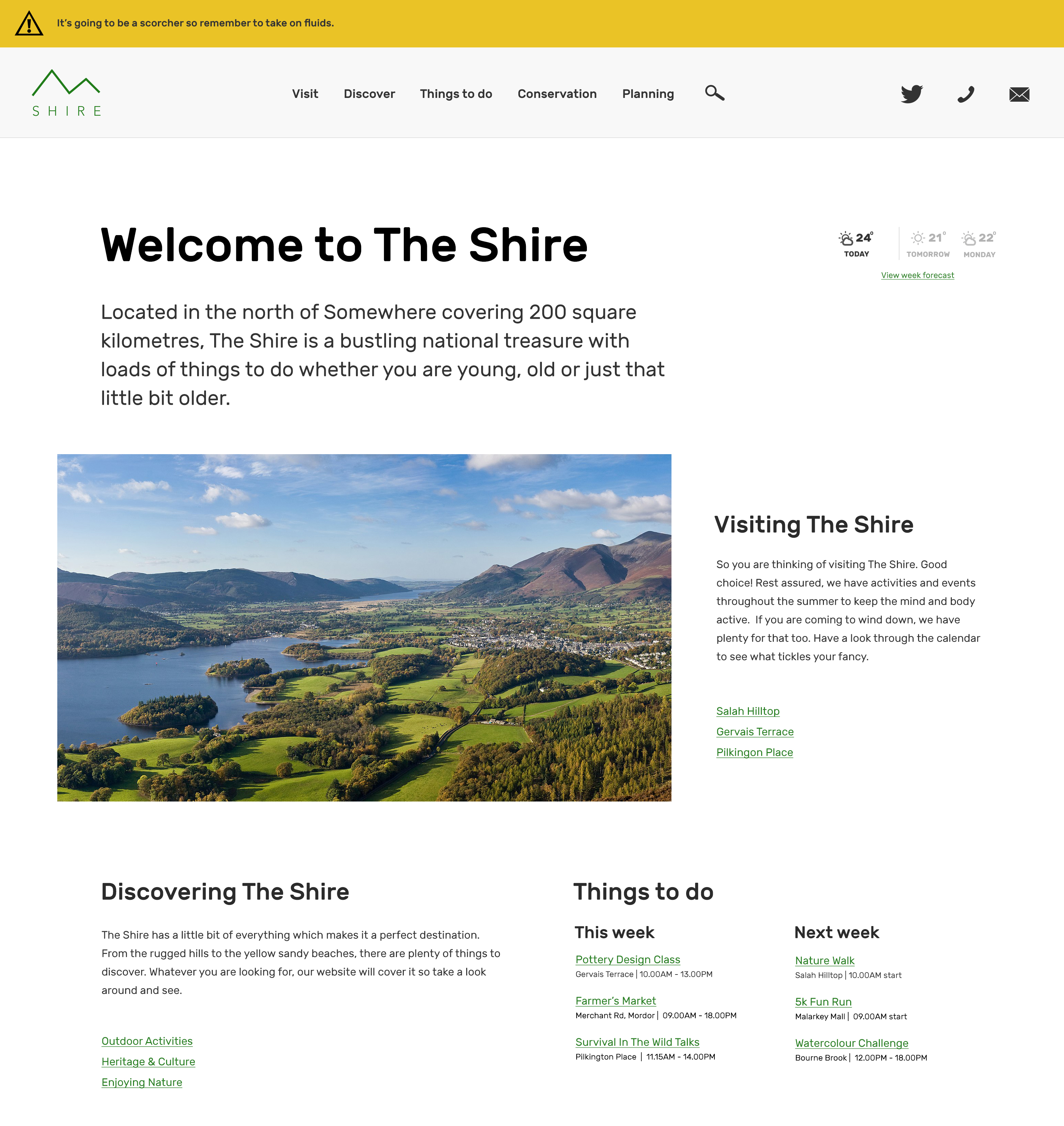
Anyway, here is my final homepage design or as much as I needed to do.