I work with a lot of web pages. Some big, some little. It is mainly eCommerce pages like Products and Listings but occasionally I get to have a play with content management system (CMS for short) pages. Your standard eCommerce pages don’t really need to change too much in terms of layout as they tend to follow a pattern that users recognise but some pages give you a chance to be a bit more creative.
More often than not though, you tend to see a page with a header, and then a long column of text, usually full width from top to bottom.
Yawn.
The line length will be too much and users will either find it hard to read or boring and move away. You might get the odd image but it will not have been croppped right or is too big or too small.
It doesn’t have to be like that.
I must state now that with all the best will in the world, once you hand over a site to a client, you run the risk of only ever seeing the one column pages again but if you prepare in advance, you can hand over some nice templates that utilise a good grid or two. And with the introduction of CSS Grid, you can get some nice layouts pretty easily.
I had a go at replicating some magazine articles from Print into the Web world using Grid and Flexbox which you can see below.
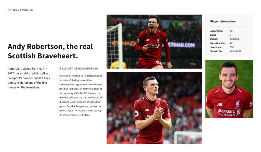
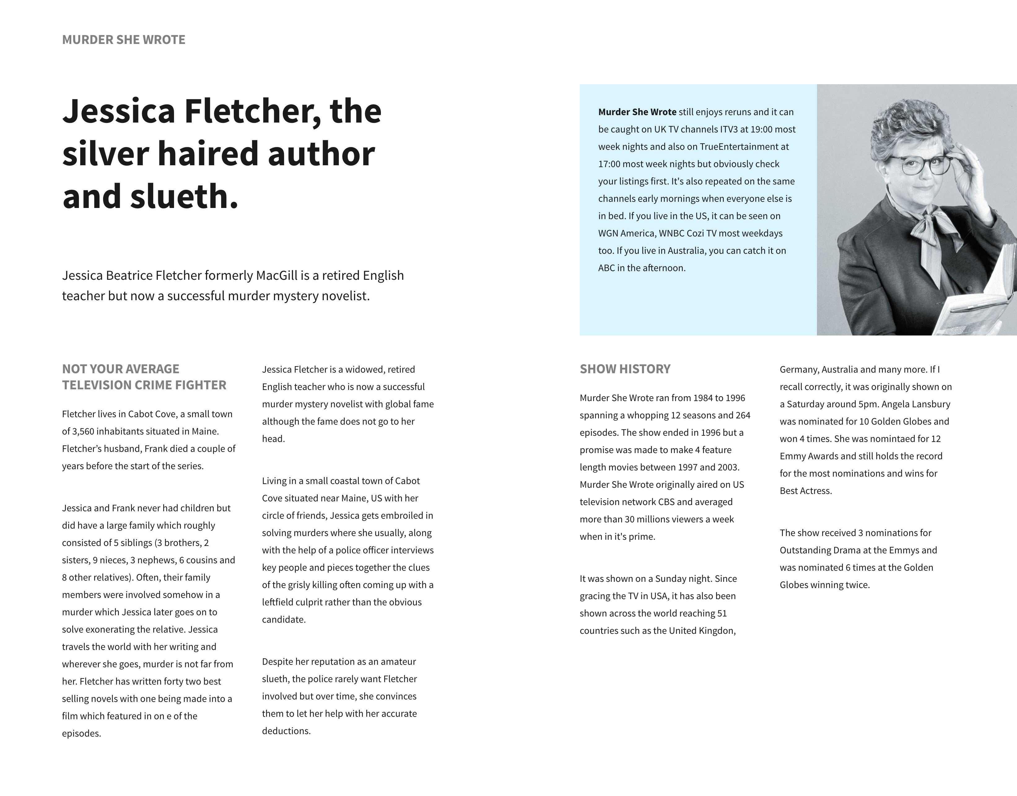
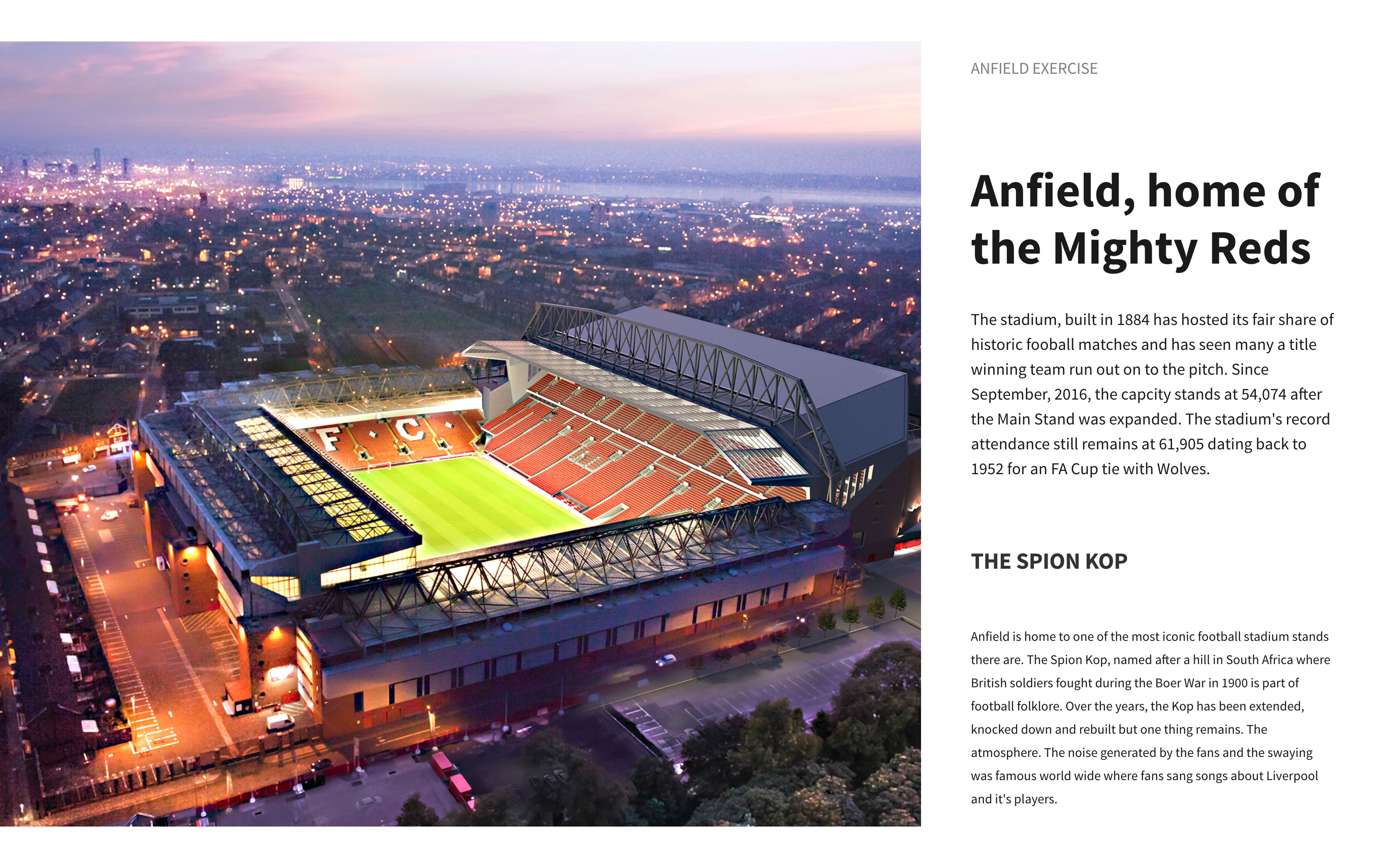
As you can see, not a long column of full width text in sight. Where there would be, I’ve used CSS columns and let the browser decide where they sit.
Designing these pages is a lot easier these days. We can wrap text around shapes, use interesting layouts and animations to bring the page to life. Of course there is the elephant in the room. Old Browsers.
We’re slowly moving away from the dinosaurs but some still exist and a lot of new features don’t work so its up to you really if you cater for them.
In summary
It’s easy to dismiss CMS pages as just filler, especially around eCommerce sites. but they do serve a purpose and I see no need to not carry your design through from the first page to the last so think on and make them less boring and cheap looking.