If like me you have looked at many a website over the years, you will have seen sites and often still do where you see large amounts of text that span the entire page width. The problem with this is that is often very hard for the user to read as it’s not legible. It never really used to be an issue as we used to design to fixed width screens but with responsiveness and various different devices, dealing with this issue has become something we have to address. It’s known in the trade as ‘line length’.
Line length is the term used for the amount of characters on one line whether it be a book, newspaper or website. Having the right amount of characters on one line is the difference between your content being legible to read and not. It turns out, our mind when reading takes a lot in. It also looks for the end of lines and is energised when it jumps to the next, however, if this happens a lot, that effect wears off and it loses interest as the rhythm is interrupted. You end up skipping words and start to get stressed albeit on a subconscious level. If the line is too long, the mind starts to lose focus. It also finds it hard to find the next line especially with large amounts of text..
At the beginning of every new line the reader is focused, but this focus gradually wears off over the duration of the line Emil Ruder, Swiss typographer and graphic designer
So what is the desired length of text and what can we do to achieve the right results? You should be aiming to get 45 to 90* characters on a line including spaces. Some sources say 45 to 60 and some say up to 90 so let’s play it safe and include both. To achieve that on the web, you can do a few things to ensure your text is legible and not causing the user issues.
You could add a width to the block of text or the container to ensure the content never gets wider. Sometimes I add a max-width of around 75% but this might hinder your design so only use it if it helps.
[edit]I found out that there is a unit of measurement we can use and that is ‘ch’ which means ‘characters’ so we can add a max-width to a paragraph of 90ch and it will stop at 90 characters wide.[/edit].
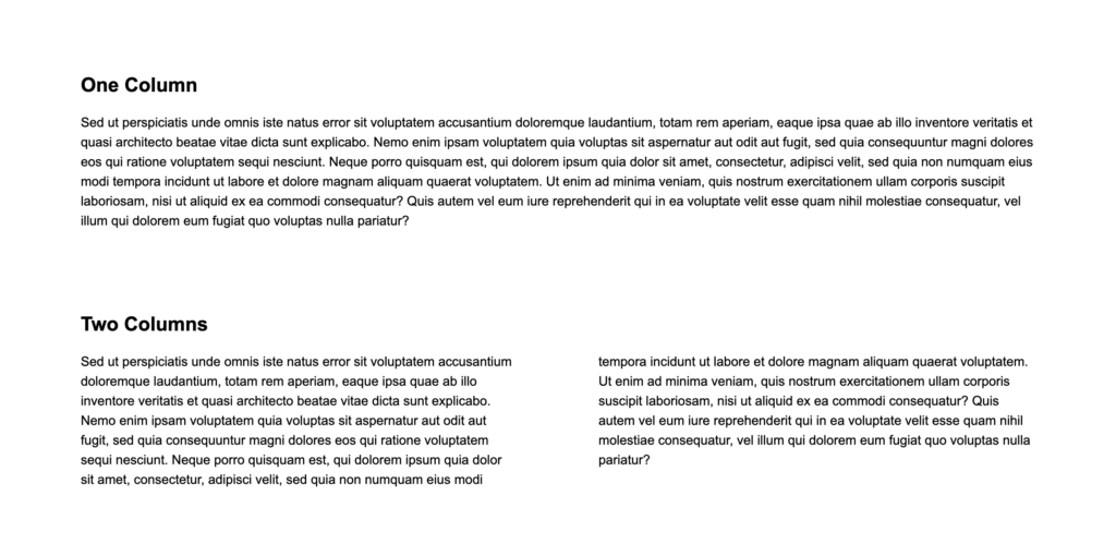
Another option is to introduce CSS columns. Browser support for this is very good so you should have no issues unless you need to support IE9 or below. A typical setup for columns is below. Essentially we are saying we want 2 columns, both 300px wide and a gap between of 100px.
column-count: 2;
column-width: 300px;
column-gap: 100px;
Below is an example where we have a one column layout and a two column layout. The latter is much better from a visual point of view as well as being more legible.
Also something else to consider is interline spacing or line height / leading as you probably know it as. Choosing the right spacing can have such a massive impact on the legibility of your content so be wary of that when you work with copy.
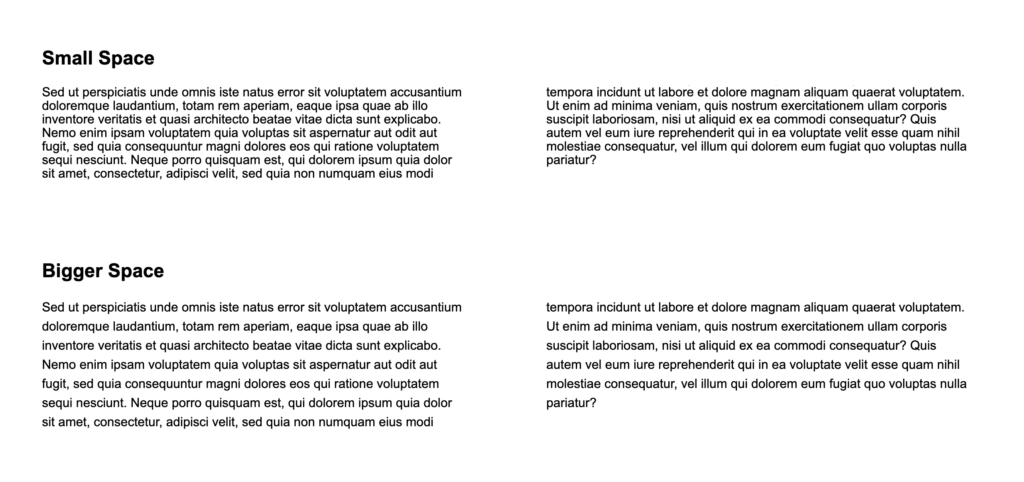
As you can see, the text with the bigger space is easier to read. There is a good article about this here.
Another factor to consider is font size. Smaller the font, the more characters will sit on one line so that could be something you trial when looking for the right levels of legibility. Hopefully, this gives you some ideas on how to possibly improve the legibility of your website text.
* I have since amended this number to 90 from 75 after some more reading up.
Extra reading
https://www.paulolyslager.com/optimal-text-layout-line-length/
https://baymard.com/blog/line-length-readability
https://practicaltypography.com/line-length.html