Print to CSS
First off, why?
I'm a huge fan of magazine layouts, the use of typography, the structures, just the general look. I also love CSS Grid and as part of my learning, I have been looking at magazines for inspiration so I decided to merge the two things together and recreate some of the print work that I've seen and liked. I have to thank Andy Clarke for the inspiration and support on this. I've mentioned it many times now but the work he is doing has really hit a chord with me and it is by far the most enjoyable thing for me right now.
Now I must stress that these have been built with layout in mind and not the aesthetics although I didn't want them to look shite either but the exercise was to purely match like for like as best I could so they won't be winning on the first page of Dribbble anytime soon.
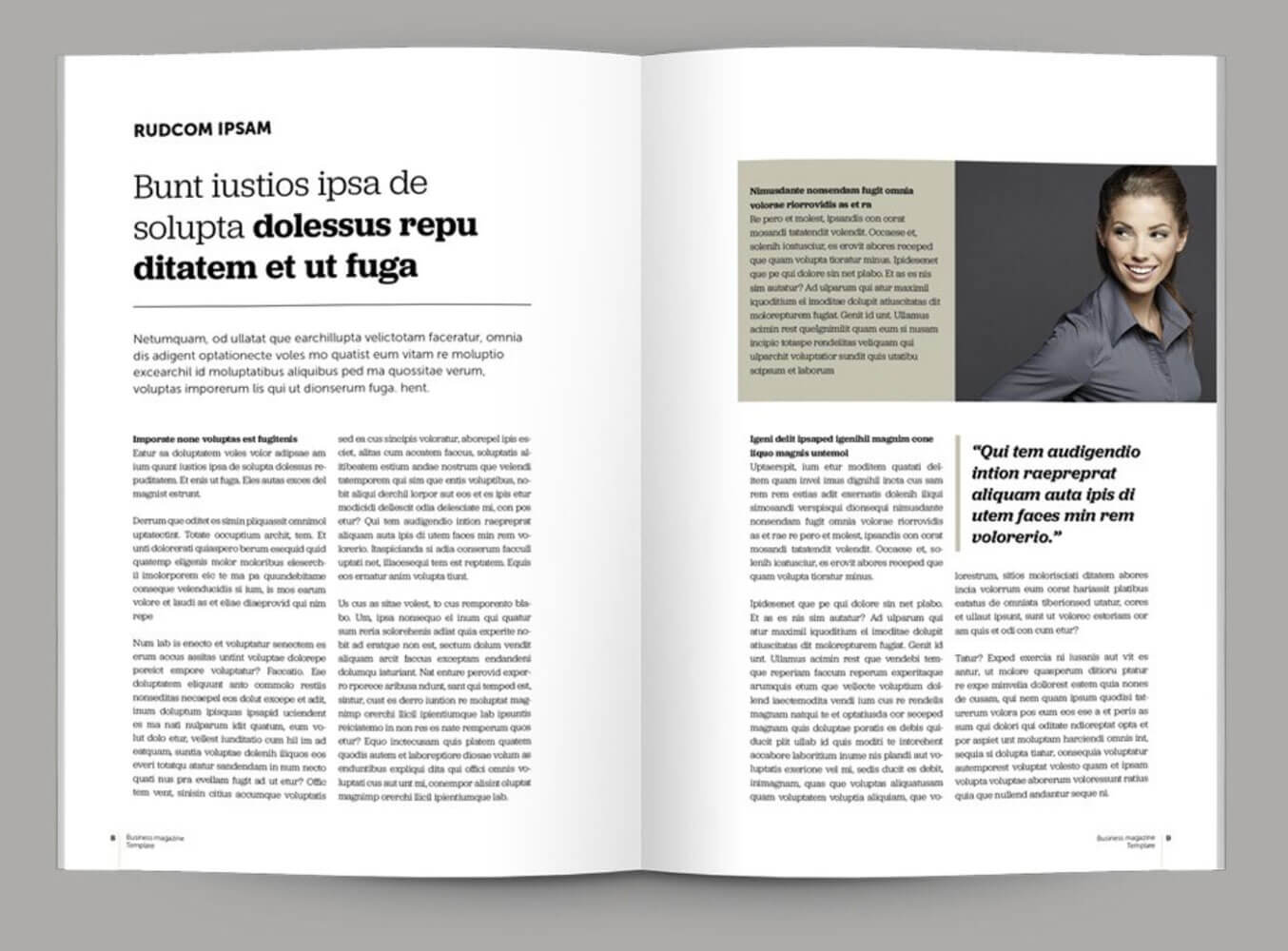
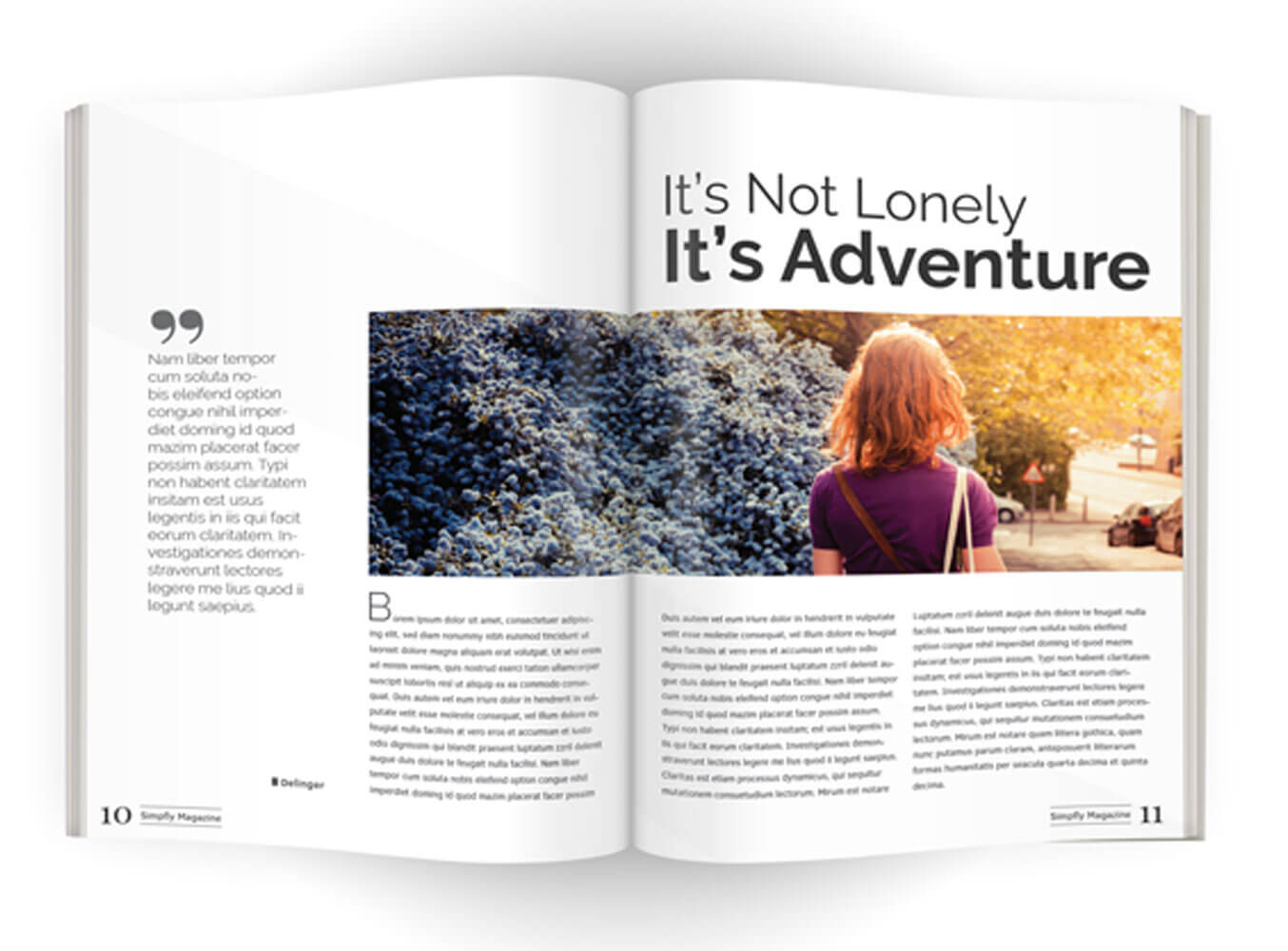
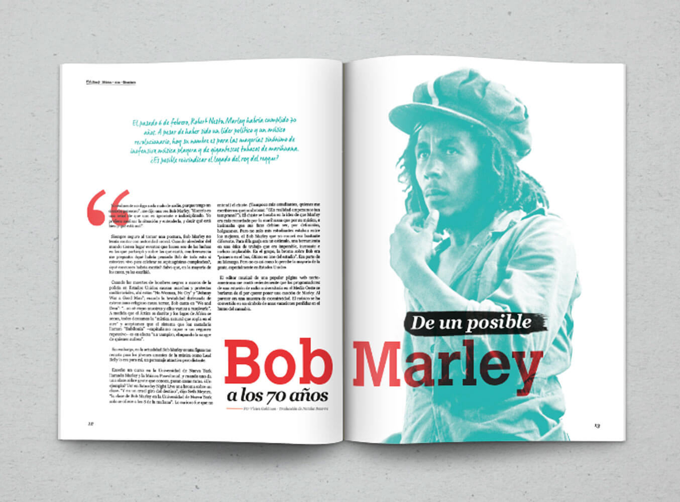
Layout Number One
This was my first true effort at emulating a print magazine article. Using Pinterest has really helped finding inspiration and I found a selection of magazine templates that stood out.
The biggest challenge with this one was the images and having them to the right and then doing something with them on mobile/tablet. To be very honest, I probably could do a lot more with the smaller viewports and might revisit them.
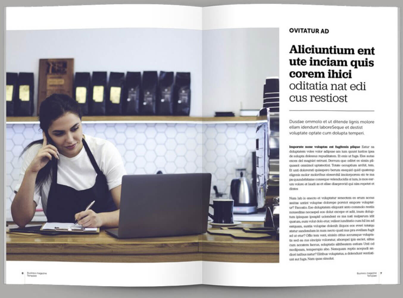
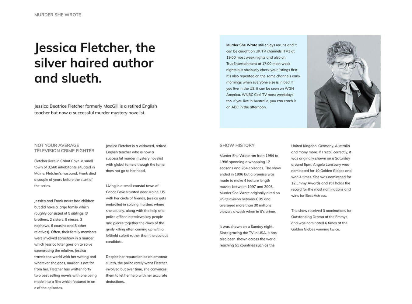
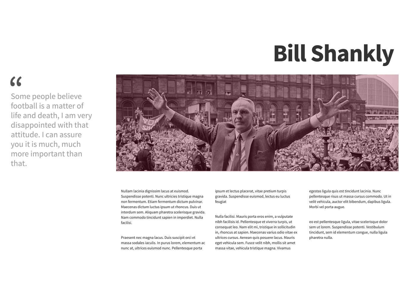
Layout Number Two
This was one of the more simpler pages. Be interesting to see what happens should it have more content below and how that works. Have used object-fit to ensure the photo fills the space.
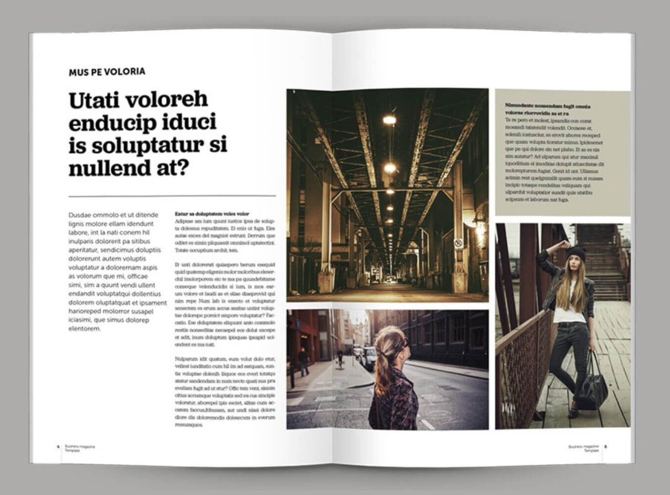
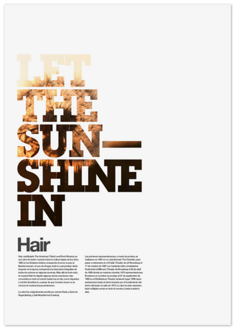
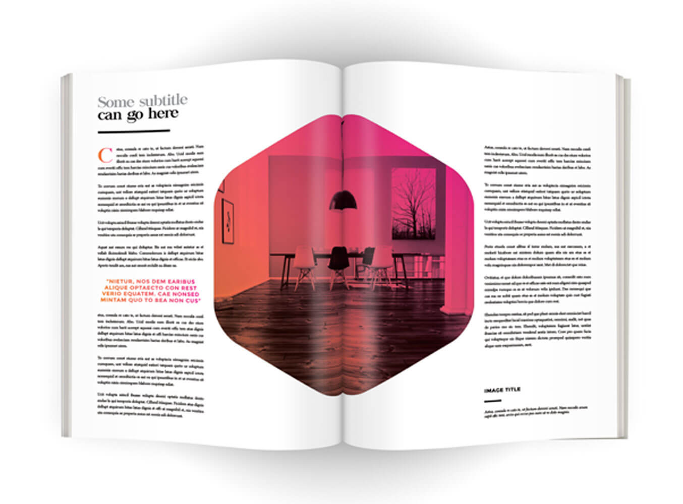
Layout Number Three
This ended up being a pain to get right on mobile and tablet based on how I built it for desktop. I think the biggest issue with this layout is the empty column in the middle where the page split would be. Maybe I would lose this column in future. This was the 3rd template from the collection I mentioned off Pinterest.
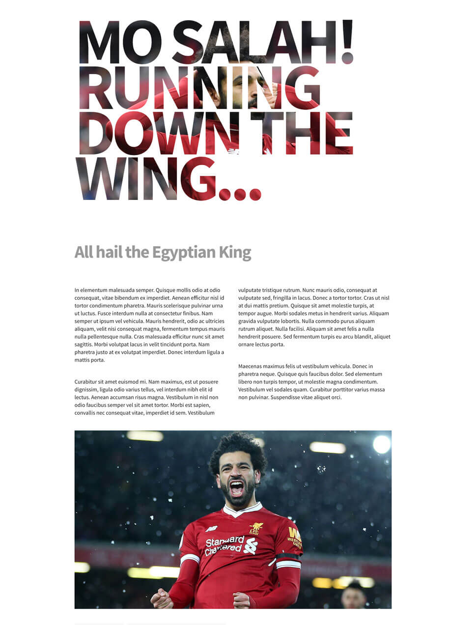
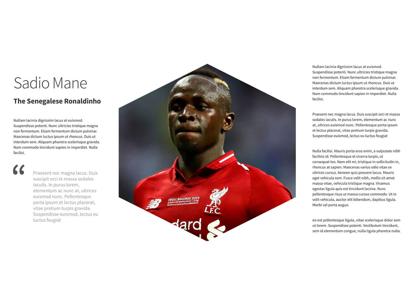
Layout Number Four
Mo Salah Mo Salah, running down the wing! I saw the original article and fell in love with the image cut out in the text so had to give it a go. I've never used background-clip before so this was a good lession. This was hard to get right across devices as things moved around a lot but I think it worked. Really battled with CSS on this one and I'm pleased with how it came out although the choice of image will make or break this thing.
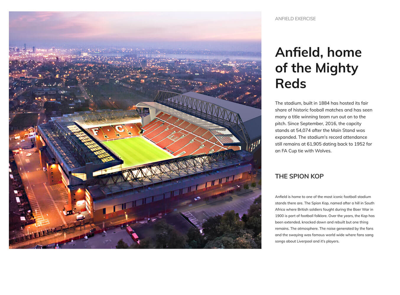
Layout Number Five
Biggest challenge of this was getting the text to fit top to bottom and then the image to fill the space. Image was easy enough in the end but the text simply would not play ball. In the end, I had to resort to getting it to fit with plenty of space should it adjust and try and break out.
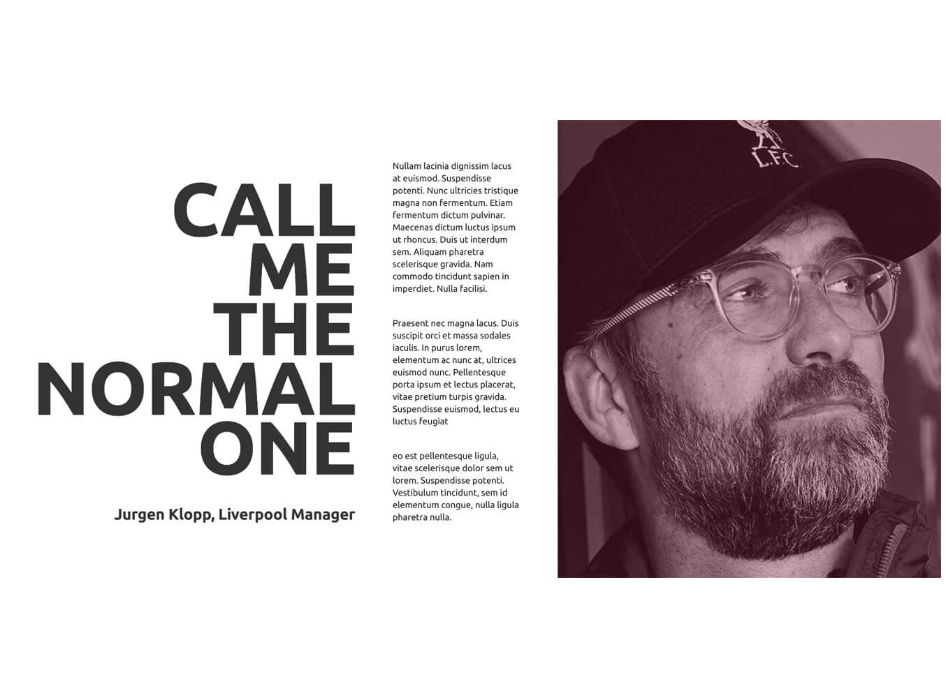
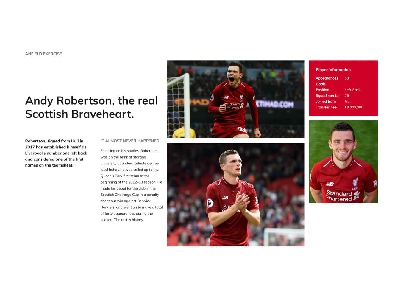
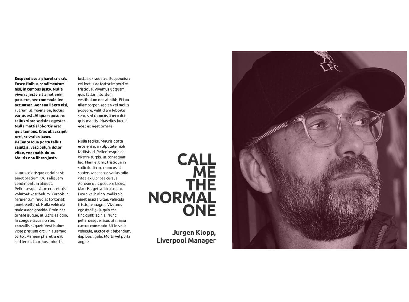
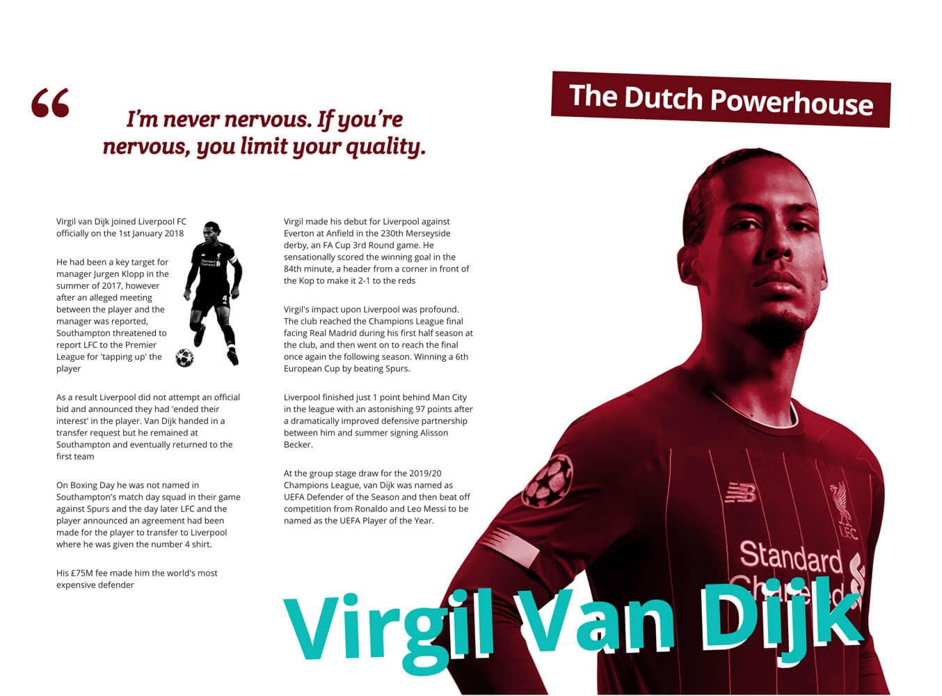
Layout Number Six
Pretty much the same as the last one. There is much less screen to play with compared to the print design and then you have to consider what happens on smaller screens. What a beautiful man though.
Layout Number Seven
Quite a simple one this really. I like the layout and seemed to work down to mobile quite straightforward. No dramas here.
Layout Number Eight
On the face of it, pretty simple and it was. Biggest challenge was what to do with it on tablet.
Layout Number Nine
This has been my favourite. The original article is lovely. This was pretty hard to do with Grid or at least it started off that way. I tried using Grid areas to achieve what I wanted but found that limiting around the header and the images so resorting back to using my usual method. Once I had to cracked on desktop, I hard to start from scratch with mobile and tablet and it took a bit of time to make it looks alright on smaller screens and then fixing what I used but I got there. Was a challenge for sure.
So in summary…
First off, I've found a new love. Print. For years we've been saying print designers should not be designing for the web. well just maybe we were wrong. There is some absolutely lovely work out there. It's made me want to explore the print side and also to improve my typography.
Secondly, CSS Grid is just brilliant, as is flexbox. You've changed my life, my outcome and my desire to do cool stuff.
This was a really hard exercise at times to fight with devices and thinking of solutions but I think what I've done it alright. Like I said before, it's not going to win designer awards but it's stepping stones to hopefully making nicer things where layouts can be pushed. In hindsight, some of the stuff is not that complicated and some of it not that impressive but simply getting some of it to work on smaller screens was a challenge in itself.
Lastly, to those that drove me on to do this. I feel like I've spammed a fair bit with this so sorry in advance but it seems some people do like what I've doing and maybe they might be influenced to have a go. I'm no expert, there are far better people out there to learn from that's for certain.
If you decide to have a go at doing something similar, let me know. I can't wait to see what you did with it as the Udemy adverts go.