If you haven’t noticed already, I’m a big fan of CSS Grid. It’s 100% has changed how I see and build websites these days. Of course, grids have been around for many many years so designing to a grid is nothing new but until recently, we’ve not had the tools to really utilise them to their full potential as layout on the web was pretty broken. Flexbox has helped massively but Grid really lets us push the boundaries and quite easily too.
Now I’m not here to give you a blow by blow account of grid and how to use it. There are far better sites out there than what I can explain.
A good start would be https://css-tricks.com/snippets/css/complete-guide-grid/
What I do want to talk about it what I have been doing with Grid since I stumbled across it.
Print Designers Should Not Touch Websites
We used to say that print designers had no place in the web world. “You can tell it’s done by a print designer” we would say. I was very guilty of it myself. It wasn’t a case of us thinking they could not design something, it was more they couldn’t design something that worked on the web and when responsive web design came about, that opened up a bigger can of worms.
Print Designers Can Design Websites
But things have changed in my opinion. The gap between what we can do on the web compared to print has shrunk to the point now where we can emulate print design quite easily on the web. Now many would argue that we always could to a degree. And to be fair, we possibly could at the expense of clean CSS and markup. But now, we can really create print like work for the digital world and it’s responsive too.
Print To CSS
One of the things I have been doing in my downtime is looking at print work and trying to emulate that for the web. I started out looking at magazines for inspiration and then creating a copy in CSS and HTML. I found that most layouts were possible and didn’t take a lot of effort to do.
One of the reasons to do this was to really make use of the space and work with the content at hand so that it looked more interesting and not the standard one column job lot you normally see. I wanted to turn ordinary pages of content into something that looked appetising to read. I work in eCommerce, I see a lot of pages that just look plonked on the page and for me, these pages are still important pages compared to listing and products.
So with a bit of clever CSS and some structured markup, we can take a standard one column page and make it look more appealing. For now, ignore the finer details of the design. This is purely a layout discussion.
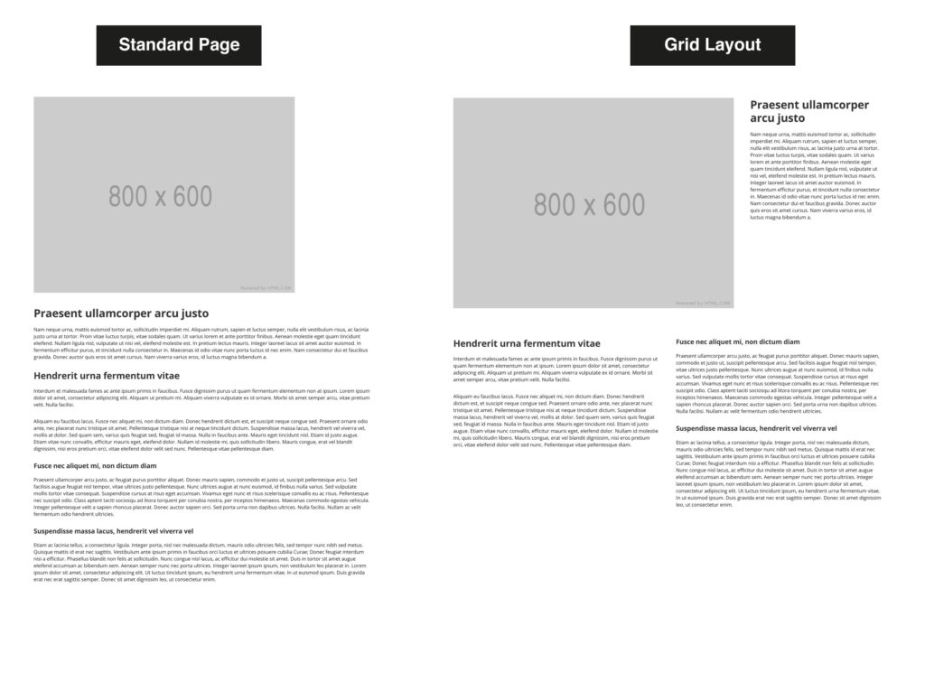
CSS wise, what we have done here is use a 6 column grid and positioned sections using the grid-column rule. Now there may be better ways of doing this so I encourage you to explore.
main {
   display: grid;
   grid-template-columns: repeat(6,1fr);
   grid-gap: 50px;
}

.hero-img {
   grid-column: 1/5;
}

.hero-content {
   grid-column: 5/7;
}

.main-content {
   grid-column: 1/4;
}

.supporting-content {
   grid-column: 4/7;
}
Such possibilities
Working this way gives us so many ways of laying out a page. I switched to a 3 column layout and again, with some moving about, we get the following…
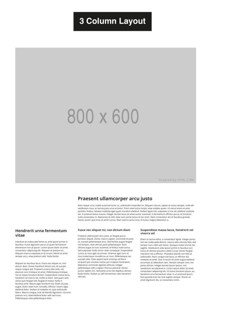
And the CSS…
main {
   display: grid;
   grid-template-columns: repeat(3,1fr);
   grid-gap: 50px;
}

.hero-img {
   grid-column: 1/-1;
}

.hero-content {
   grid-column: 2/4;
}

.main-content {
   grid-column: 1;
}

.supporting-content {
   grid-column: 2/4;
   display: grid;
   grid-template-columns: 1fr 1fr;
   grid-gap: 50px;
}
As you can see, it’s not that hard to rejig a page around.
Print is beautiful
I encourage you all to look at books, magazines and posters. Although it has different rules to web, there really is a lot we can take from the print world and into the digital land.
This is a screenshot from my Pinterest feed. All print work but it has the makings for some beautiful web work if we want it.
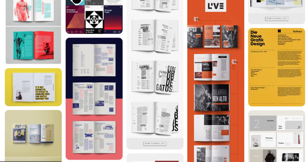
There is so much good work out there for inspiration. I used to trawl dribbble for stuff but since finally finding a use for Pinterest, I am glued to the site looking at what people are creating and seeing if I can recreate it in CSS.
Some things I have learnt over time though. Not everything is possible. Let us be honest here for a minute. We can make things close to, very close, more so with textual work but we are restricted on some things but that’s part of the fun in trying plus it should not stop us producing great work.
Print to CSS series
I did a series of print to CSS builds to try and mimic what I saw and some things were pretty easy to mimic whereas some were really hard and didn’t leave me with great CSS but it was such an enjoyable project. What was really interesting was that for mobile and tablet, you really have a clean slate as obviously print is for one layout. This also hinders desktop at times. With print, you have a defined space and that is what you work with whereas with a desktop screen, you have different variations and text, images won’t always stay in the same place which is why I say you cannot really match a print layout 100%.
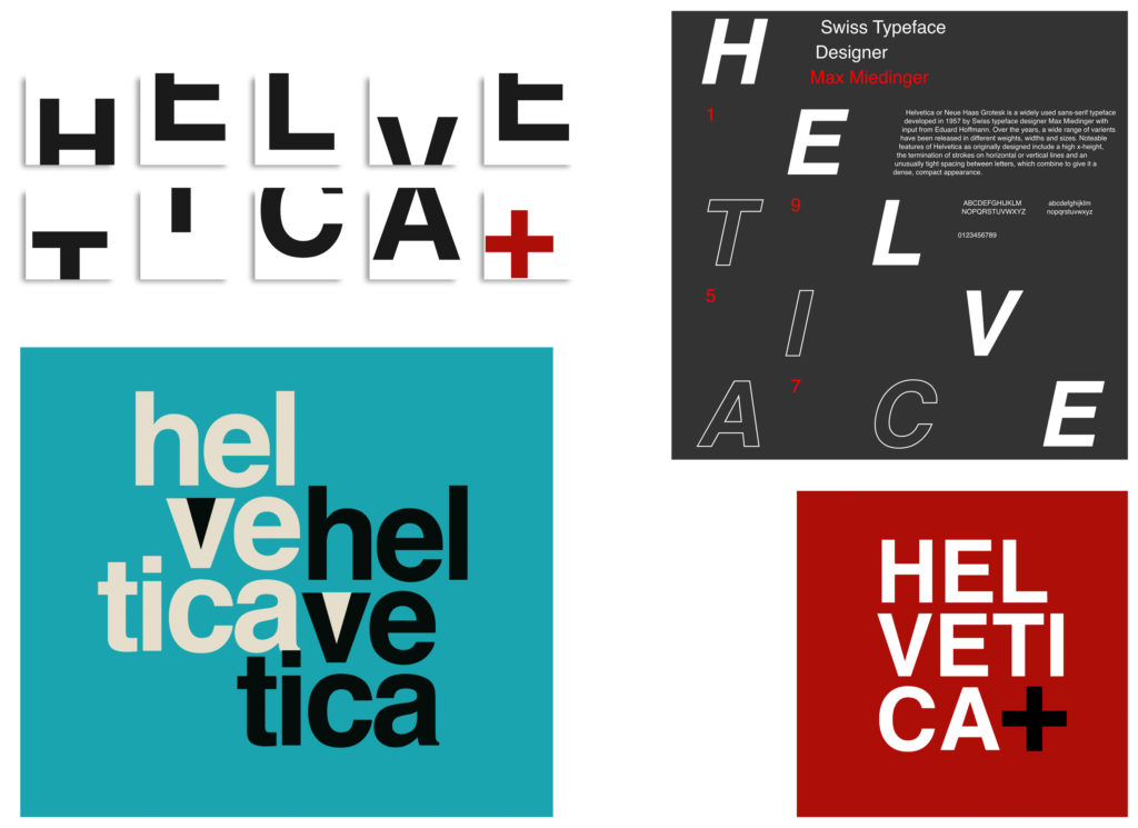
Posters
As well as magazine articles for inspiration, I have been looking at posters, mainly typography ones as I find them easiest. I have been trying out a few ideas and again, whilst I can get them looking close enough, it’s still not right across the board and sometimes I would say what goes on in print stays in print but again you don’t know until you try. The results are still pretty cool despite the messy markup and CSS and has given me ideas on future projects and maybe some ideas for print work too.
In summary
CSS grid and flexbox are amazing and can help you achieve some really nice designs. But you can’t do it alone without them. You need to be creative and there is plenty of inspiration out there to make something ‘pop’. We’re surrounded by nice design, great typography and daring layout, pages don’t need to be boring.
I’m not the only one
There are others out there producing great work with grid, really pushing what can be done. We have Andy Clarke with his use of retro designs to produce really snazzy pages.
Having CSS fun for my next webinar. pic.twitter.com/eCVccCoKHq
— Andy Clarke (@Malarkey) October 24, 2019
There is Olivia Ng and her great use of Grid on her codepen account and Michelle Barker, creator of this great compound grid tool. There is loads of great content out there to be inspired by. The future is pretty cool for the web. We’re in the age of exciting, daring designs. The end of mediocre design.